

WTF is a Feature Graphic?
In short, it’s a static asset that acts as a thumbnail for your Google Play Store promo video.
(We are talking about graphic assets for app store submitting, and marketing – in this case specifically for Google Play / Android, not iOS / Apple App Store)

According to Android developer guidelines, A feature graphic is required for all apps that get a feature placement.
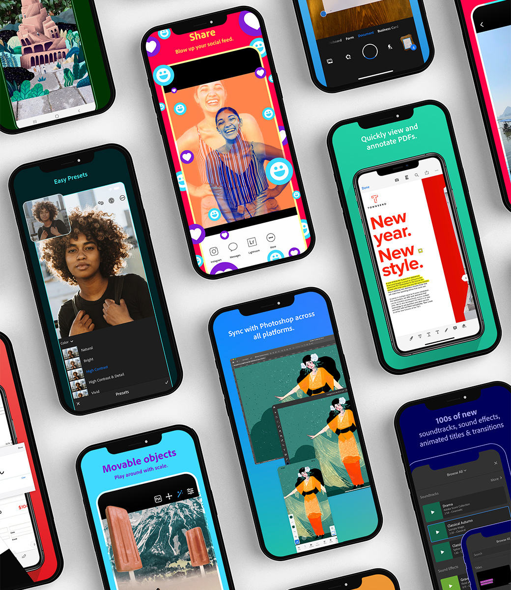
But, lots of major app players don’t include a promo video or a feature graphic in their Google Play listing.
Best Practices
Limit text to your app name and maybe a few additional descriptive words, make any information in your graphic direct and to the point. Don’t create a text-heavy advertising-style graphic.
Use vivid foreground and background colors, don’t let the graphic fade into the background.
Create a story and a sense of context to humanize your app.
Have an iconic point of focus in your imagery. Try not to repeat your app logo in your feature graphic, instead use images that complement your brand.
Don’t include any important visual information near the borders of the image, specifically near the bottom third of the frame.
Use a similar or complementing color theme and style in the feature graphic, app icon, and the app itself, so users can immediately associate them with your app and brand. For more advice, see the Material Design guidelines.
Use large font sizes that are legible across multiple screen sizes. Also, don’t overload the graphic with fine details, these will not be visible on many phone screens.
Localize your graphic and textas appropriate for different markets and languages.
Don’t use information that needs updating frequently, unless you make a plan to update it as needed. Do update your feature graphic to promote activities such as LiveOps, an event promotion, a sale, or something similar. Make sure you update it again when the activity completes.
Create an image that will look good whether displayed on a large or small screen, remembering that while the image’s aspect ratio is consistent across devices, the size does vary. To test, resize your image to 1 inch in width. If it still looks good and conveys your brand message, you have a winner.
Don’t include inappropriate or repetitive image elements, such as third-party trademarked characters or logos without permission, device imagery (as this can become obsolete quickly or alienate some users), screenshots, advertisements, Google Play or any other store’s badge or icon, or any content in violation of the Developer Program policies.
Remember to include the feature graphic as a priority item in-store listing experiments.

The Specs
JPEG or 24-bit PNG (no alpha) | Dimensions: 1024px by 500px
The Tips
Don't include any copy or important visual information near the borders of the asset - specifically near the bottom third of the frame.
If adding text, use large font sizes.
Your graphic may be displayed alone without the app icon.